
Everyone knows you shouldn’t get carried away after the first round of football. If your team wins, it doesn’t mean they’re a lock on the Premiership, and if they lose you should postpone your descent into despair. After three games, the same caution is generally exercised – winning three out of three is certainly better than losing three, but fans probably shouldn’t get too carried away either way. The question is: at what point of the season should we start to get excited, or deflated, based on how our team is performing?
One way to answer this question is by examining the relationship between teams’ records after a certain number of games,and their record at the end of the season. The chart below does this for round 5. Each dot in the chart is a team in a season between 1987 and 2015 (inclusive, excluding 1993). The horizontal axis shows the team’s record – expressed as a percentage of games won – after round 5. On the vertical axis, we see each team’s winning percentage at the end of the home-and-away season for that year. We can see that no teams that lost their first five games ended up winning more than 50% of their games for the season, while only two teams who won their first 5 ended up winning less than 50% of their games that season. The dark line is a linear regression line – you can think of it as a sort of average, meaning that teams that lose their first five tend to win only around a quarter of their games for the year, while teams that win their first five tend to win around three-quarters of their games in the season.
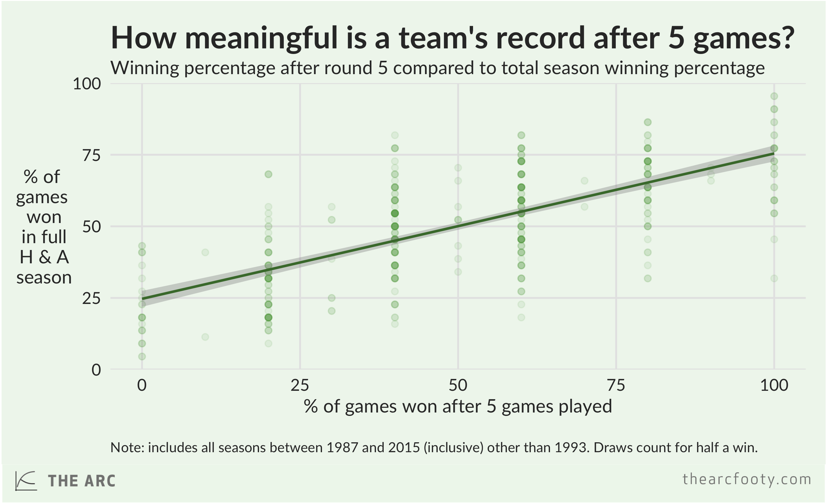
You can see in the chart above that a team’s record after five games does tell us quite a bit about where the team is likely to end up at the end of the year. Teams that have good starts tend, on average, to have a good season. Teams that have bad starts tend to continue as they began.
However, you can also see above that quite a few of the dots – meaning teams in particular seasons – lie a fair way from the dark line. For instance, take a look at teams who have a winning percentage of 40% after the first five – these are teams that won two and lost three of their first five. While they tend, on average, to win a little less than 50% of their games for the season, there’s a fair degree of dispersion here. Teams who won two of their first five have gone on to win more than 75% of their games for the season, or to win less than 25%.
If we try to predict teams’ end-of-season records based on their performance in the first five games, we can do OK, but its far from perfect. Around 48% of teams’ end-of-season records are ‘explained’ by their records after the first five games (ie. the R2 of the regression in the chart above is 0.48).
Let’s have a look at how that compares to later rounds in the season.
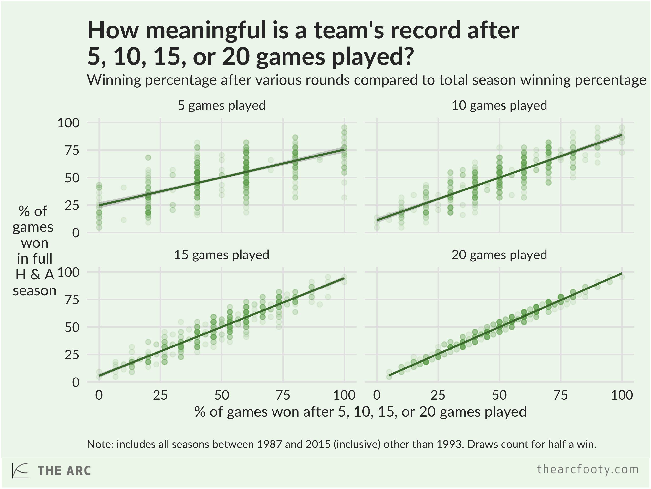
In the first chart, there’s a lot of dispersion around the dark green line. Now compare that to the next chart along, which compares teams’ records after 10 games to their end-of-season record. The dots are more closely clustered around the line. As you’d expect, a team’s record after its tenth game is much more reliable as a predictor of its end-of-season record. Around 72% of teams’ end-of-season records are ‘explained’ by their record after round 10, up from 48% after five rounds.
You can also see that after 15 and 20 games, teams are tightly clustered around the dark green line. Once we know a team’s winning percentage after 20 games, we pretty much know what their winning percentage will be after 22 games. Their record after 20 games explains 97% of their end-of-season record. With each game that’s played, the relationship between a team’s winning percentage and their end-of-season winning percentage gets a bit stronger. But how much stronger?
The chart below shows the strength of the relationship between a team’s record at each stage of the season and their winning percentage at the end of the season.

After teams have played their sixth game for the year, they cross the (symbolically, at least) significant 50% threshold. At this point of the year, a team’s record is fairly meaningful, as a guide to where they’ll end the home-and-away season.
Note: 1993 is excluded from these charts, as teams only played 20 games that year, which complicates things a little. The figures used in this post are regular winning percentages – unadjusted for strength of opponents, travel schedule, etc.