
How much do AFL teams’ midfields improve or decline from one year to the next? To answer that question, first we need to figure out how to measure the quality of a team’s midfield. One simple and compelling measure, used elsewhere, is to look at the ratio between a team’s inside 50s and the inside 50s of its opponents.1 This makes sense because the job of a team’s midfield is to get the ball inside the attacking 50m arc as many times as possible, while preventing their opponents from doing the same thing.
In the past home-and-away season, Geelong had the league’s best midfield by this measure; they managed to get the ball inside their attacking 50m arc 1.27 times for every time inside 50 they gave up to their opponents. The teams you’d expect join them up the top of the midfield ladder, with the Bulldogs in the number two spot. Languishing down the bottom were Brisbane and Essendon.
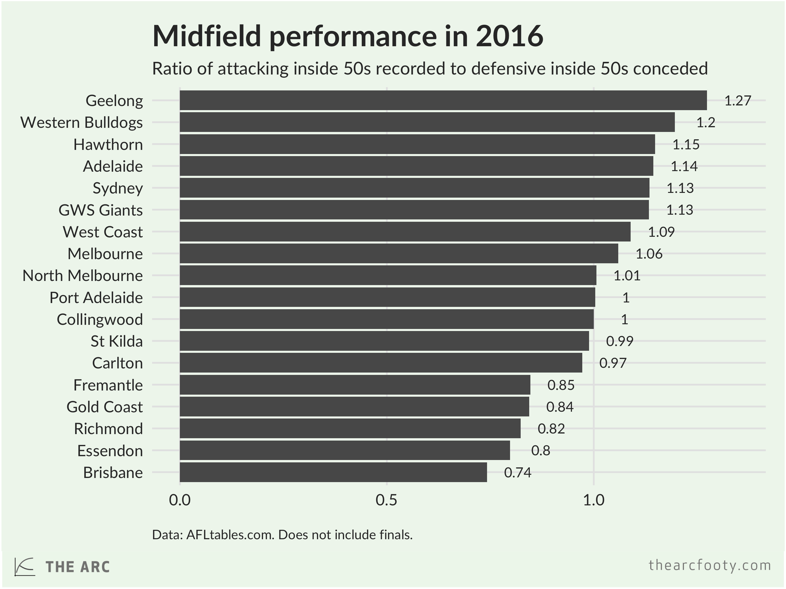
Over the period since 1998, which is the earliest season for which we have inside 50 stats, the largest year-on-year improvement in midfield performance was recorded by the 2011 Eagles, who had an inside 50 ratio of 1.22 compared to a ratio of just 0.89 in 2010. The 2016 Cats are right up there among the most improved midfields in the past couple of decades; adding Patrick Dangerfield in his Brownlow-winning year saw them go from an average midfield performance in 2015 (ratio of 0.99) to a dominant league-best performance in 2016 (1.27). The worst decline for a midfield since 1998 belongs to the 2016 Dockers, who went from an above-average performance in 2015 (1.15) to well below average in 2016 (0.85).
Midfield performance is somewhat predictable, year-to-year. Declines on the scale of the 2016 Dockers are uncommon. If we know how well a midfield performed one year, we can have a reasonable guess at how well it will perform the following year, as shown in the following chart.

The inside 50-based measure of midfield strength lines up pretty well, although not perfectly, to other measures. If we rate teams by their contested possession ratio2, the ratings look pretty similar.3 Geelong and the Bulldogs are still at the top of the midfield table, with teams like Collingwood and Melbourne in the middle of the pack.
So what should we expect from teams’ midfields in 2017? Both Collingwood and Melbourne had roughly average midfields this year. If I had to guess how good their midfields will be next year, my first guess would be “roughly average,” but I wouldn’t be surprised if either team improved or regressed a little. I’d be surprised if any team pulled a Geelong and went from an average midfield this year to a dominant midfield next year. No one has added Patrick Dangerfield to their roster this off-season.
Yet Champion Data predict that Collingwood will have the best midfield next year, while Melbourne will have the worst. They’ve used much more sophisticated measures to calculate teams’ midfield strengths, employing a “complex formula” to compare each team’s midfielders to league average. Their measure looks at the quality of a team’s individual midfielders, as opposed to the team’s midfield as a whole. Still, it’s a surprise to hear that Melbourne, having added Jordan Lewis to its engine room, is expected to regress so dramatically in the midfield next year, while Collingwood soars in the opposite direction. Without access to CD’s data, nor the complex formula they’ve used to rate midfielders, we can’t see how well those measures line up with our simple metrics of teams’ midfield performance.
If you’d like to have a look at how your team’s midfield performance has changed over the years on our simple metrics, have a look at the table below. It shows the simple team midfield measure we’ve used in this post, for each team since 1998 for inside 50s and since 1999 for contested possessions.
Midfield quality
| Team | Season | Inside 50 ratio | Contested possession ratio | Change in I50 ratio | Change in cont. poss. ratio |
|---|---|---|---|---|---|
| Collingwood | 2011 | 1.33 | 1.12 | 0.07 | 0.03 |
| Geelong | 2008 | 1.31 | 1.09 | 0.12 | 0.01 |
| Geelong | 2011 | 1.31 | 1.06 | 0.20 | 0.01 |
| Hawthorn | 2015 | 1.30 | 1.01 | 0.12 | -0.02 |
| St Kilda | 2009 | 1.30 | 1.07 | 0.27 | 0.09 |
| Hawthorn | 2012 | 1.29 | 1.05 | 0.04 | -0.01 |
| Essendon | 2000 | 1.28 | 1.10 | 0.23 | 0.09 |
| Geelong | 2016 | 1.27 | 1.09 | 0.28 | 0.14 |
| West Coast | 2015 | 1.27 | 1.09 | 0.21 | 0.10 |
| Adelaide | 2006 | 1.26 | 1.05 | 0.04 | 0.00 |
| Collingwood | 2010 | 1.26 | 1.09 | 0.15 | 0.07 |
| Geelong | 2013 | 1.25 | 1.02 | 0.07 | 0.04 |
| Hawthorn | 2011 | 1.25 | 1.06 | 0.19 | 0.10 |
| Port Adelaide | 2014 | 1.24 | 1.03 | 0.15 | 0.04 |
| Adelaide | 2002 | 1.23 | 1.08 | 0.02 | 0.05 |
| Brisbane | 1999 | 1.23 | 1.04 | 0.26 | 0.00 |
| Adelaide | 2005 | 1.22 | 1.05 | 0.13 | -0.03 |
| Carlton | 2000 | 1.22 | 1.07 | 0.20 | 0.04 |
| West Coast | 2011 | 1.22 | 1.07 | 0.32 | 0.10 |
| Adelaide | 2001 | 1.21 | 1.03 | 0.12 | 0.04 |
| Brisbane | 2004 | 1.21 | 1.09 | 0.11 | 0.07 |
| Hawthorn | 2008 | 1.21 | 0.98 | 0.08 | 0.01 |
| St Kilda | 2004 | 1.21 | 1.02 | 0.18 | 0.06 |
| St Kilda | 2005 | 1.21 | 1.11 | 0.00 | 0.09 |
| Geelong | 2007 | 1.20 | 1.08 | 0.22 | 0.05 |
| Geelong | 2009 | 1.20 | 1.09 | -0.11 | 0.00 |
| Richmond | 2012 | 1.20 | 1.06 | 0.29 | 0.12 |
| Sydney | 2014 | 1.20 | 1.02 | 0.12 | -0.03 |
| Western Bulldogs | 2016 | 1.20 | 1.11 | 0.10 | 0.10 |
| Hawthorn | 2014 | 1.19 | 1.03 | 0.02 | 0.00 |
| Adelaide | 2003 | 1.18 | 1.08 | -0.04 | 0.01 |
| Adelaide | 2009 | 1.18 | 0.99 | 0.15 | -0.08 |
| Brisbane | 2002 | 1.18 | 1.01 | 0.04 | -0.02 |
| Carlton | 2001 | 1.18 | 1.09 | -0.04 | 0.02 |
| Geelong | 2012 | 1.18 | 0.98 | -0.13 | -0.08 |
| Sydney | 2006 | 1.18 | 1.03 | 0.10 | -0.01 |
| Adelaide | 1998 | 1.17 | 0.00 | 0.00 | 0.00 |
| Collingwood | 2013 | 1.17 | 1.04 | 0.12 | -0.01 |
| Hawthorn | 2013 | 1.17 | 1.03 | -0.12 | -0.03 |
| Carlton | 2011 | 1.15 | 1.09 | 0.10 | 0.09 |
| Fremantle | 2015 | 1.15 | 1.07 | 0.02 | 0.00 |
| Hawthorn | 2016 | 1.15 | 0.89 | -0.16 | -0.12 |
| West Coast | 2012 | 1.15 | 1.02 | -0.07 | -0.05 |
| Adelaide | 2016 | 1.14 | 1.02 | 0.05 | -0.05 |
| Essendon | 2001 | 1.14 | 1.02 | -0.14 | -0.08 |
| Geelong | 2005 | 1.14 | 1.04 | 0.03 | 0.08 |
| St Kilda | 2006 | 1.14 | 0.99 | -0.08 | -0.13 |
| Brisbane | 2000 | 1.13 | 0.99 | -0.11 | -0.06 |
| Brisbane | 2001 | 1.13 | 1.03 | 0.00 | 0.05 |
| Essendon | 2014 | 1.13 | 1.02 | 0.04 | 0.04 |
| Fremantle | 2014 | 1.13 | 1.07 | 0.04 | 0.08 |
| GWS Giants | 2016 | 1.13 | 1.09 | 0.18 | 0.14 |
| Hawthorn | 2007 | 1.13 | 0.97 | 0.20 | 0.01 |
| St Kilda | 2010 | 1.13 | 1.02 | -0.17 | -0.05 |
| Sydney | 2012 | 1.13 | 1.01 | 0.03 | -0.02 |
| Sydney | 2016 | 1.13 | 1.09 | 0.01 | 0.08 |
| West Coast | 2005 | 1.13 | 1.12 | 0.09 | 0.07 |
| Adelaide | 2010 | 1.12 | 0.98 | -0.06 | 0.00 |
| Carlton | 2012 | 1.12 | 1.04 | -0.03 | -0.05 |
| Geelong | 2010 | 1.12 | 1.05 | -0.09 | -0.04 |
| Sydney | 2015 | 1.12 | 1.01 | -0.08 | -0.01 |
| Western Bulldogs | 2009 | 1.12 | 1.05 | 0.06 | 0.01 |
| Collingwood | 2009 | 1.11 | 1.01 | 0.07 | -0.01 |
| Geelong | 2004 | 1.11 | 0.96 | 0.10 | -0.03 |
| Melbourne | 2000 | 1.11 | 0.99 | 0.17 | 0.03 |
| Melbourne | 2004 | 1.11 | 0.99 | 0.16 | 0.03 |
| Port Adelaide | 2001 | 1.11 | 1.06 | 0.14 | 0.05 |
| Richmond | 1998 | 1.11 | 0.00 | 0.00 | 0.00 |
| St Kilda | 2012 | 1.11 | 1.00 | 0.11 | 0.06 |
| Brisbane | 2003 | 1.10 | 1.03 | -0.08 | 0.02 |
| Geelong | 2014 | 1.10 | 0.99 | -0.15 | -0.03 |
| Port Adelaide | 2003 | 1.10 | 1.01 | 0.04 | -0.11 |
| Western Bulldogs | 2015 | 1.10 | 1.01 | 0.13 | -0.01 |
| Adelaide | 2004 | 1.09 | 1.07 | -0.09 | -0.01 |
| Adelaide | 2015 | 1.09 | 1.07 | 0.04 | 0.03 |
| Essendon | 2013 | 1.09 | 0.98 | 0.07 | -0.03 |
| Fremantle | 2013 | 1.09 | 0.99 | 0.03 | -0.06 |
| Port Adelaide | 2013 | 1.09 | 0.99 | 0.23 | 0.02 |
| Sydney | 2005 | 1.09 | 1.04 | 0.08 | 0.08 |
| Sydney | 2007 | 1.09 | 1.00 | -0.09 | -0.03 |
| Sydney | 2011 | 1.09 | 1.02 | 0.06 | -0.05 |
| Sydney | 2013 | 1.09 | 1.05 | -0.04 | 0.04 |
| Western Bulldogs | 1998 | 1.09 | 0.00 | 0.00 | 0.00 |
| West Coast | 2016 | 1.09 | 1.01 | -0.18 | -0.08 |
| Adelaide | 2000 | 1.08 | 0.99 | 0.10 | 0.06 |
| North Melbourne | 2012 | 1.08 | 0.98 | 0.06 | -0.03 |
| Richmond | 2013 | 1.08 | 1.07 | -0.12 | 0.01 |
| Richmond | 2015 | 1.08 | 1.06 | 0.05 | 0.02 |
| West Coast | 2006 | 1.08 | 1.17 | -0.05 | 0.05 |
| Adelaide | 2013 | 1.07 | 1.02 | 0.01 | -0.08 |
| Collingwood | 2015 | 1.07 | 1.03 | 0.09 | 0.05 |
| Melbourne | 1998 | 1.07 | 0.00 | 0.00 | 0.00 |
| St Kilda | 2007 | 1.07 | 1.02 | -0.07 | 0.03 |
| West Coast | 2007 | 1.07 | 1.11 | -0.01 | -0.06 |
| Adelaide | 2012 | 1.06 | 1.10 | 0.11 | 0.13 |
| Adelaide | 2014 | 1.06 | 1.04 | -0.01 | 0.02 |
| Collingwood | 2012 | 1.06 | 1.05 | -0.28 | -0.07 |
| Fremantle | 2012 | 1.06 | 1.05 | 0.15 | 0.06 |
| Hawthorn | 2010 | 1.06 | 0.96 | 0.01 | 0.02 |
| Melbourne | 2016 | 1.06 | 1.04 | 0.23 | 0.04 |
| Port Adelaide | 2002 | 1.06 | 1.12 | -0.05 | 0.06 |
| Western Bulldogs | 1999 | 1.06 | 1.08 | -0.03 | 0.00 |
| Western Bulldogs | 2008 | 1.06 | 1.04 | 0.17 | 0.15 |
| West Coast | 2014 | 1.06 | 0.99 | 0.13 | 0.01 |
| Adelaide | 2007 | 1.05 | 1.06 | -0.21 | 0.02 |
| Carlton | 2009 | 1.05 | 1.01 | 0.05 | 0.01 |
| Carlton | 2010 | 1.05 | 1.00 | 0.00 | -0.01 |
| Collingwood | 2001 | 1.05 | 1.04 | 0.12 | 0.06 |
| Collingwood | 2003 | 1.05 | 1.07 | 0.03 | 0.01 |
| Collingwood | 2008 | 1.05 | 1.02 | 0.02 | 0.04 |
| Essendon | 1999 | 1.05 | 1.00 | 0.15 | 0.00 |
| Geelong | 2001 | 1.05 | 0.95 | 0.05 | -0.05 |
| Port Adelaide | 2007 | 1.05 | 1.05 | 0.13 | 0.06 |
| St Kilda | 1999 | 1.05 | 0.99 | 0.14 | 0.00 |
| Western Bulldogs | 2010 | 1.05 | 1.06 | -0.07 | 0.01 |
| West Coast | 2003 | 1.05 | 1.08 | 0.07 | 0.10 |
| West Coast | 2004 | 1.05 | 1.05 | 0.00 | -0.03 |
| Carlton | 2013 | 1.04 | 1.06 | -0.08 | 0.02 |
| Fremantle | 2006 | 1.04 | 0.97 | 0.11 | 0.00 |
| Fremantle | 2008 | 1.04 | 1.01 | 0.04 | 0.04 |
| Hawthorn | 2009 | 1.04 | 0.94 | -0.17 | -0.04 |
| Sydney | 2008 | 1.04 | 1.01 | -0.05 | 0.01 |
| Adelaide | 2008 | 1.03 | 1.06 | -0.02 | 0.00 |
| Brisbane | 2007 | 1.03 | 0.99 | 0.09 | 0.03 |
| Carlton | 1998 | 1.03 | 0.00 | 0.00 | 0.00 |
| Collingwood | 2007 | 1.03 | 0.98 | 0.02 | -0.06 |
| Essendon | 2011 | 1.03 | 1.01 | 0.15 | 0.02 |
| Essendon | 2012 | 1.03 | 1.01 | 0.00 | 0.00 |
| Geelong | 2002 | 1.03 | 1.04 | -0.02 | 0.08 |
| Hawthorn | 2003 | 1.03 | 0.93 | 0.04 | -0.01 |
| North Melbourne | 2013 | 1.03 | 1.06 | -0.05 | 0.08 |
| Port Adelaide | 2004 | 1.03 | 1.03 | -0.08 | 0.02 |
| Richmond | 2014 | 1.03 | 1.04 | -0.05 | -0.02 |
| St Kilda | 2003 | 1.03 | 0.96 | 0.14 | 0.01 |
| St Kilda | 2008 | 1.03 | 0.98 | -0.04 | -0.03 |
| Sydney | 1999 | 1.03 | 1.04 | 0.02 | 0.00 |
| Sydney | 2002 | 1.03 | 0.92 | 0.02 | -0.08 |
| Sydney | 2010 | 1.03 | 1.07 | 0.10 | 0.06 |
| Western Bulldogs | 2005 | 1.03 | 0.90 | 0.11 | -0.10 |
| Brisbane | 2008 | 1.02 | 0.96 | -0.01 | -0.03 |
| Carlton | 1999 | 1.02 | 1.03 | -0.01 | 0.00 |
| Collingwood | 2002 | 1.02 | 1.06 | -0.03 | 0.03 |
| Essendon | 2003 | 1.02 | 1.02 | 0.02 | 0.02 |
| North Melbourne | 2011 | 1.02 | 1.01 | 0.08 | 0.04 |
| Port Adelaide | 2015 | 1.02 | 0.99 | -0.22 | -0.05 |
| Collingwood | 2006 | 1.01 | 1.04 | 0.14 | 0.08 |
| Geelong | 2003 | 1.01 | 0.99 | -0.02 | -0.04 |
| North Melbourne | 2016 | 1.01 | 1.02 | 0.04 | -0.01 |
| Melbourne | 2002 | 1.01 | 0.96 | 0.08 | 0.01 |
| Port Adelaide | 1998 | 1.01 | 0.00 | 0.00 | 0.00 |
| Richmond | 2005 | 1.01 | 1.10 | 0.16 | 0.11 |
| Sydney | 1998 | 1.01 | 0.00 | 0.00 | 0.00 |
| Sydney | 2001 | 1.01 | 0.99 | 0.07 | 0.06 |
| Sydney | 2003 | 1.01 | 0.94 | -0.02 | 0.02 |
| Sydney | 2004 | 1.01 | 0.96 | 0.00 | 0.02 |
| Western Bulldogs | 2006 | 1.01 | 0.89 | -0.02 | -0.01 |
| West Coast | 1999 | 1.01 | 0.96 | 0.08 | 0.00 |
| Brisbane | 2009 | 1.00 | 0.97 | -0.03 | 0.01 |
| Carlton | 2008 | 1.00 | 1.00 | 0.10 | 0.03 |
| Collingwood | 2016 | 1.00 | 1.03 | -0.07 | 0.00 |
| Essendon | 2002 | 1.00 | 1.00 | -0.14 | -0.02 |
| Fremantle | 2007 | 1.00 | 0.96 | -0.04 | -0.01 |
| Geelong | 1998 | 1.00 | 0.00 | 0.00 | 0.00 |
| North Melbourne | 1998 | 1.00 | 0.00 | 0.00 | 0.00 |
| North Melbourne | 2000 | 1.00 | 1.02 | 0.06 | -0.01 |
| North Melbourne | 2007 | 1.00 | 1.05 | 0.06 | 0.06 |
| Port Adelaide | 2016 | 1.00 | 0.97 | -0.02 | -0.02 |
| Geelong | 2000 | 0.99 | 1.00 | 0.03 | 0.02 |
| Geelong | 2015 | 0.99 | 0.96 | -0.11 | -0.03 |
| North Melbourne | 2014 | 0.99 | 1.03 | -0.04 | -0.03 |
| Port Adelaide | 1999 | 0.99 | 0.99 | -0.02 | 0.00 |
| Richmond | 1999 | 0.99 | 1.01 | -0.12 | 0.00 |
| St Kilda | 2011 | 0.99 | 0.94 | -0.14 | -0.07 |
| St Kilda | 2016 | 0.99 | 0.97 | 0.03 | 0.02 |
| Western Bulldogs | 2013 | 0.99 | 1.09 | 0.06 | 0.06 |
| Adelaide | 1999 | 0.98 | 0.93 | -0.18 | 0.00 |
| Collingwood | 1998 | 0.98 | 0.00 | 0.00 | 0.00 |
| Collingwood | 2014 | 0.98 | 0.98 | -0.19 | -0.06 |
| Geelong | 2006 | 0.98 | 1.03 | -0.16 | -0.01 |
| Hawthorn | 2002 | 0.98 | 0.94 | 0.13 | -0.01 |
| West Coast | 2002 | 0.98 | 0.98 | 0.22 | 0.05 |
| Brisbane | 1998 | 0.97 | 0.00 | 0.00 | 0.00 |
| Carlton | 2016 | 0.97 | 0.98 | 0.18 | -0.02 |
| Essendon | 2009 | 0.97 | 0.97 | 0.11 | 0.03 |
| Fremantle | 1998 | 0.97 | 0.00 | 0.00 | 0.00 |
| North Melbourne | 2002 | 0.97 | 0.99 | 0.03 | 0.02 |
| North Melbourne | 2004 | 0.97 | 0.99 | 0.03 | 0.00 |
| North Melbourne | 2008 | 0.97 | 0.99 | -0.03 | -0.06 |
| North Melbourne | 2015 | 0.97 | 1.02 | -0.02 | 0.00 |
| Port Adelaide | 2000 | 0.97 | 1.01 | -0.02 | 0.03 |
| Richmond | 2001 | 0.97 | 1.06 | 0.03 | 0.03 |
| Richmond | 2008 | 0.97 | 1.06 | 0.09 | 0.10 |
| Western Bulldogs | 2014 | 0.97 | 1.02 | -0.02 | -0.07 |
| Essendon | 2004 | 0.96 | 0.98 | -0.06 | -0.04 |
| Fremantle | 2003 | 0.96 | 0.98 | 0.04 | 0.05 |
| Fremantle | 2004 | 0.96 | 0.98 | 0.00 | 0.00 |
| Fremantle | 2010 | 0.96 | 0.98 | 0.09 | 0.03 |
| Geelong | 1999 | 0.96 | 0.98 | -0.03 | 0.00 |
| GWS Giants | 2015 | 0.96 | 0.95 | 0.12 | 0.03 |
| North Melbourne | 2005 | 0.96 | 0.99 | 0.00 | 0.00 |
| Melbourne | 2006 | 0.96 | 0.97 | 0.01 | 0.02 |
| Port Adelaide | 2005 | 0.96 | 0.98 | -0.06 | -0.05 |
| St Kilda | 2015 | 0.96 | 0.94 | 0.15 | -0.02 |
| West Coast | 2009 | 0.96 | 1.06 | 0.11 | 0.04 |
| Adelaide | 2011 | 0.95 | 0.97 | -0.17 | -0.01 |
| Collingwood | 2004 | 0.95 | 0.96 | -0.10 | -0.12 |
| Fremantle | 1999 | 0.95 | 0.97 | -0.02 | 0.00 |
| Melbourne | 2003 | 0.95 | 0.96 | -0.06 | 0.00 |
| Melbourne | 2005 | 0.95 | 0.95 | -0.16 | -0.04 |
| Port Adelaide | 2008 | 0.95 | 0.95 | -0.10 | -0.10 |
| Richmond | 2000 | 0.95 | 1.04 | -0.05 | 0.03 |
| Richmond | 2003 | 0.95 | 1.04 | 0.03 | -0.02 |
| Western Bulldogs | 2000 | 0.95 | 1.05 | -0.11 | -0.03 |
| Western Bulldogs | 2001 | 0.95 | 1.06 | 0.00 | 0.01 |
| Brisbane | 2005 | 0.94 | 0.94 | -0.27 | -0.16 |
| Brisbane | 2006 | 0.94 | 0.96 | 0.00 | 0.02 |
| Brisbane | 2013 | 0.94 | 0.95 | 0.07 | -0.01 |
| Essendon | 2006 | 0.94 | 0.98 | 0.04 | 0.01 |
| North Melbourne | 1999 | 0.94 | 1.03 | -0.06 | 0.00 |
| North Melbourne | 2001 | 0.94 | 0.97 | -0.06 | -0.05 |
| North Melbourne | 2003 | 0.94 | 1.00 | -0.03 | 0.00 |
| North Melbourne | 2006 | 0.94 | 0.99 | -0.02 | 0.00 |
| North Melbourne | 2010 | 0.94 | 0.97 | 0.10 | -0.02 |
| Melbourne | 1999 | 0.94 | 0.96 | -0.13 | 0.00 |
| Port Adelaide | 2010 | 0.94 | 1.01 | 0.02 | 0.02 |
| Richmond | 2006 | 0.94 | 1.02 | -0.07 | -0.09 |
| St Kilda | 2001 | 0.94 | 0.92 | 0.06 | -0.07 |
| Sydney | 2000 | 0.94 | 0.93 | -0.10 | -0.11 |
| Western Bulldogs | 2002 | 0.94 | 1.07 | -0.01 | 0.01 |
| Collingwood | 2000 | 0.93 | 0.98 | 0.02 | -0.04 |
| Hawthorn | 2006 | 0.93 | 0.96 | 0.05 | 0.04 |
| Melbourne | 2001 | 0.93 | 0.95 | -0.18 | -0.04 |
| Sydney | 2009 | 0.93 | 1.01 | -0.10 | 0.00 |
| Western Bulldogs | 2004 | 0.93 | 1.00 | 0.04 | 0.06 |
| Western Bulldogs | 2012 | 0.93 | 1.03 | 0.03 | 0.03 |
| West Coast | 1998 | 0.93 | 0.00 | 0.00 | 0.00 |
| Fremantle | 2002 | 0.92 | 0.93 | 0.02 | -0.03 |
| Fremantle | 2005 | 0.92 | 0.97 | -0.03 | -0.01 |
| Hawthorn | 1999 | 0.92 | 0.97 | 0.03 | 0.00 |
| Port Adelaide | 2006 | 0.92 | 0.99 | -0.04 | 0.01 |
| Port Adelaide | 2009 | 0.92 | 0.99 | -0.03 | 0.04 |
| Richmond | 2002 | 0.92 | 1.06 | -0.05 | 0.00 |
| West Coast | 2013 | 0.92 | 0.98 | -0.22 | -0.04 |
| Brisbane | 2010 | 0.91 | 0.92 | -0.08 | -0.05 |
| Carlton | 2007 | 0.91 | 0.96 | 0.07 | -0.01 |
| Collingwood | 1999 | 0.91 | 1.02 | -0.07 | 0.00 |
| Fremantle | 2000 | 0.91 | 0.95 | -0.04 | -0.02 |
| Fremantle | 2011 | 0.91 | 0.99 | -0.05 | 0.01 |
| Gold Coast | 2013 | 0.91 | 0.99 | 0.18 | 0.10 |
| Richmond | 2011 | 0.91 | 0.94 | 0.01 | 0.00 |
| Carlton | 2002 | 0.90 | 0.94 | -0.28 | -0.15 |
| Carlton | 2005 | 0.90 | 0.96 | 0.04 | -0.05 |
| Essendon | 1998 | 0.90 | 0.00 | 0.00 | 0.00 |
| Fremantle | 2001 | 0.90 | 0.96 | -0.01 | 0.01 |
| Gold Coast | 2014 | 0.90 | 0.97 | -0.01 | -0.02 |
| Richmond | 2010 | 0.90 | 0.94 | 0.06 | -0.08 |
| St Kilda | 1998 | 0.90 | 0.00 | 0.00 | 0.00 |
| St Kilda | 2013 | 0.90 | 0.98 | -0.21 | -0.02 |
| West Coast | 2000 | 0.90 | 0.93 | -0.10 | -0.02 |
| West Coast | 2010 | 0.90 | 0.97 | -0.06 | -0.08 |
| Carlton | 2014 | 0.89 | 1.01 | -0.15 | -0.05 |
| Essendon | 2005 | 0.89 | 0.98 | -0.07 | 0.00 |
| Essendon | 2015 | 0.89 | 0.95 | -0.25 | -0.07 |
| Hawthorn | 1998 | 0.89 | 0.00 | 0.00 | 0.00 |
| Melbourne | 2011 | 0.89 | 0.96 | 0.02 | -0.03 |
| St Kilda | 2000 | 0.89 | 1.00 | -0.16 | 0.01 |
| St Kilda | 2002 | 0.89 | 0.95 | -0.05 | 0.02 |
| Western Bulldogs | 2011 | 0.89 | 1.00 | -0.16 | -0.06 |
| Essendon | 2007 | 0.88 | 0.98 | -0.06 | 0.00 |
| Essendon | 2010 | 0.88 | 0.99 | -0.10 | 0.02 |
| Hawthorn | 2005 | 0.88 | 0.93 | 0.06 | 0.01 |
| Richmond | 2007 | 0.88 | 0.97 | -0.06 | -0.05 |
| Western Bulldogs | 2003 | 0.88 | 0.94 | -0.06 | -0.13 |
| Western Bulldogs | 2007 | 0.88 | 0.89 | -0.13 | 0.00 |
| Collingwood | 2005 | 0.87 | 0.97 | -0.08 | 0.01 |
| Fremantle | 2009 | 0.87 | 0.95 | -0.16 | -0.06 |
| Melbourne | 2010 | 0.87 | 0.99 | 0.04 | 0.09 |
| Brisbane | 2012 | 0.86 | 0.96 | 0.05 | 0.05 |
| Carlton | 2004 | 0.86 | 1.01 | 0.03 | 0.02 |
| Essendon | 2008 | 0.86 | 0.95 | -0.02 | -0.04 |
| Melbourne | 2007 | 0.86 | 0.95 | -0.10 | -0.02 |
| Port Adelaide | 2012 | 0.86 | 0.97 | 0.13 | 0.04 |
| Fremantle | 2016 | 0.85 | 0.95 | -0.31 | -0.12 |
| Hawthorn | 2000 | 0.85 | 0.97 | -0.08 | -0.01 |
| Hawthorn | 2001 | 0.85 | 0.94 | 0.01 | -0.02 |
| Richmond | 2004 | 0.85 | 1.00 | -0.10 | -0.04 |
| West Coast | 2008 | 0.85 | 1.01 | -0.22 | -0.10 |
| Brisbane | 2014 | 0.84 | 0.89 | -0.09 | -0.06 |
| Carlton | 2003 | 0.84 | 0.99 | -0.06 | 0.05 |
| Carlton | 2006 | 0.84 | 0.97 | -0.06 | 0.01 |
| Gold Coast | 2016 | 0.84 | 0.95 | 0.05 | 0.03 |
| GWS Giants | 2014 | 0.84 | 0.92 | 0.17 | 0.05 |
| North Melbourne | 2009 | 0.84 | 0.99 | -0.13 | 0.00 |
| Melbourne | 2009 | 0.83 | 0.90 | 0.08 | 0.00 |
| Melbourne | 2015 | 0.83 | 0.99 | 0.06 | 0.00 |
| Richmond | 2009 | 0.83 | 1.02 | -0.14 | -0.05 |
| Brisbane | 2015 | 0.82 | 0.93 | -0.02 | 0.04 |
| Hawthorn | 2004 | 0.82 | 0.91 | -0.21 | -0.01 |
| Richmond | 2016 | 0.82 | 1.00 | -0.26 | -0.06 |
| Brisbane | 2011 | 0.81 | 0.91 | -0.10 | -0.02 |
| Melbourne | 2012 | 0.81 | 0.92 | -0.08 | -0.04 |
| St Kilda | 2014 | 0.81 | 0.96 | -0.09 | -0.03 |
| Essendon | 2016 | 0.80 | 0.92 | -0.09 | -0.03 |
| Carlton | 2015 | 0.79 | 1.00 | -0.10 | -0.01 |
| Gold Coast | 2015 | 0.79 | 0.92 | -0.11 | -0.05 |
| Gold Coast | 2011 | 0.78 | 0.95 | 0.00 | 0.00 |
| Melbourne | 2014 | 0.78 | 0.99 | 0.09 | 0.15 |
| West Coast | 2001 | 0.76 | 0.93 | -0.14 | 0.00 |
| Melbourne | 2008 | 0.75 | 0.90 | -0.11 | -0.04 |
| Brisbane | 2016 | 0.74 | 0.90 | -0.08 | -0.02 |
| Gold Coast | 2012 | 0.73 | 0.90 | -0.06 | -0.05 |
| Port Adelaide | 2011 | 0.73 | 0.93 | -0.21 | -0.08 |
| Melbourne | 2013 | 0.69 | 0.84 | -0.11 | -0.08 |
| GWS Giants | 2013 | 0.67 | 0.88 | 0.05 | -0.03 |
| GWS Giants | 2012 | 0.61 | 0.91 | 0.00 | 0.00 |
- In this post, we’re not adjusting for opponent strength, but because we’re using regular season totals this shouldn’t make too much of a difference.
- Calculated as the ratio of average contested possessions for to average contested possessions against, per home-and-away game
- The correlation coefficient between I50 ratio and contested possession ratio over the period 1999-2016 is 0.64.